What Does the Lockheed Martin Logo Mean? The Story Behind the Star
As someone who has spent years nerding out over aerospace history, I learned everything there is to know about corporate identity in defense contracting the hard way — standing in front of a full-scale F-22 Raptor at an air show in Marietta, Georgia, neck craned toward the tail fin. That bold blue star just sitting there. Clean, geometric, stamped onto a machine worth roughly $143 million. Someone argued for that shape in a conference room somewhere. Probably argued pretty hard. That thought stuck with me for weeks, and eventually I went digging.
What I found was genuinely layered. The logo isn’t just a star. It’s a compressed history of two rival aerospace giants, a billion-dollar merger, and a design philosophy rooted in the oldest navigation technology humans ever developed.
The Star and the Merger
Probably should have opened with this section, honestly — because without this context, the whole thing falls apart.
March 15, 1995. That’s the date Lockheed Corporation and Martin Marietta officially completed their merger, creating what was then the largest defense contractor on the planet. The combined entity needed an identity that could carry both companies without erasing either one. Harder than it sounds.
Lockheed had been building aircraft since 1912. The Skunk Works division — based out of Palmdale, California — gave the world the U-2 spy plane, the SR-71 Blackbird, the F-117 Nighthawk. That name meant something in every air force procurement office on Earth. Martin Marietta had its own extraordinary weight to carry: Titan rockets, Viking Mars landers, satellite systems sophisticated enough to still be classified in some capacity. These weren’t two companies merging in any sentimental sense. They were two distinct engineering cultures with distinct institutional pride.
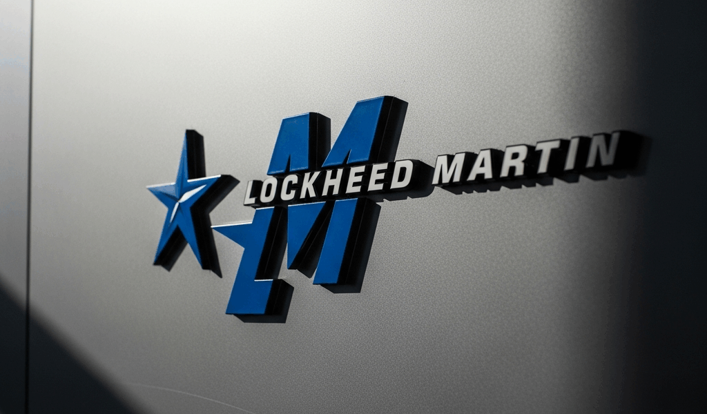
The design team landed on a single star as the centerpiece — not a stylized aircraft silhouette, not a rocket. A five-pointed star, deep blue, with a precise geometric cutout through its center creating a kind of negative-space window. The full wordmark pairs that star with “Lockheed Martin” in a bold custom typeface that feels authoritative without being aggressive about it.
That merger context is the whole ballgame. Without it, the star reads like generic corporate symbolism. With it, it reads like a carefully negotiated peace treaty expressed in graphic design — which is, more or less, exactly what it was.
The blue itself isn’t arbitrary either. Close to what designers call a federal or aerospace blue — reminiscent of the U.S. Air Force roundel and the deep color of space. In 1995, that specific shade was doing a lot of work simultaneously: trustworthy, technical, American, sky-adjacent. Defense contractors don’t pick colors casually. Brand perception in that industry translates directly into contract perception.
What the Star Symbol Represents
But what is the Lockheed Martin star, really? In essence, it’s a navigation symbol — ancient in origin, deliberately chosen. But it’s much more than that.
The company frames the star around three concepts: navigation, guidance, and aspiration. That might sound like marketing language — and honestly, some of it is. But each one holds up under pressure.
Navigation — The Oldest Technology in the Room
Before GPS, before inertial navigation systems, before radar — people found their way using stars. Specifically Polaris, the North Star. Fixed reference point. Mariners crossed entire oceans with it. Armies moved at night by it. The star as navigation symbol predates written history by a considerable margin.
Here’s what most people don’t fully register: Lockheed Martin’s fingerprints are all over GPS infrastructure — the satellites themselves, the ground control systems, the receivers embedded in precision weapons. The company that now tells your phone where you parked your car chose a star as its logo. That’s not just poetic. It’s almost literally descriptive.
Guidance — The Cutout and What It Means
The geometric cutout through the center of the star is the detail most logo breakdowns skip entirely. Don’t make my mistake of glossing past it.
That open space creates a sightline — a sense of direction through the star, like an aim point or a targeting reticle. Whether that was the explicit intent during the 1995 design process, I genuinely can’t say. But the visual effect is unmistakable. The star doesn’t just sit on the page. It points somewhere.
Precision guidance might be the best lens here, as the logo requires that reading to fully land. That is because the company’s portfolio — Hellfire missiles, JASSM cruise missiles, THAAD interceptors — is built around exactly that: directionality, accuracy, controlled force. The visual language speaks to engineers before it speaks to anyone else.
Aspiration — The Space Connection
Martin Marietta built the external tank for the Space Shuttle. Every single one of the 135 Shuttle missions flew with a tank bearing that company’s engineering work — a detail that gets lost in most retellings. When Lockheed Martin emerged from the merger, it inherited that legacy entire.
Stars, in the context of space exploration, aren’t just navigation tools. They’re destinations. The aspiration framing acknowledges that the company’s ambitions extend past Earth’s atmosphere — commercially significant in 1995 and arguably more significant today with programs like Orion and various satellite platforms that don’t get discussed publicly.
How the Logo Has Changed Over the Years
Fascinated by all of this, I went back through the visual archives of both predecessor companies. The evolution is genuinely interesting — aerospace corporate identity shifting from literal to abstract over roughly eighty years.
Early Lockheed — Aircraft as Identity
The original Lockheed Aircraft Company logos from the 1920s and 1930s were unapologetically literal. Wings. Aircraft silhouettes. A classic winged-star motif in various configurations. Red-and-white color schemes with that unmistakable aviation-age aesthetic — the kind of thing you’d recognize immediately from vintage airline posters. Nothing subtle. Nothing trying to be subtle.
By the postwar period, Lockheed had settled into a wordmark-heavy identity. The name carried enough weight on its own by then. The Skunk Works’ famous skunk mascot — a cartoon figure lifted from Al Capp’s Li’l Abner comic strip and adopted by Kelly Johnson’s team back in 1943 — became one of the most recognized secondary marks in aerospace. It lived on patches, building plaques, the occasional aircraft nose art. Never in formal corporate branding, though. That’s an important distinction.
Martin Marietta — Corporate Blue Arrives
Martin Marietta’s visual identity through the 1970s and 1980s leaned hard into structured geometric design — clean sans-serif type, institutional seriousness, that post-Apollo corporate aesthetic that said “we win government contracts” rather than “we inspire wonder.” They weren’t wrong to position themselves that way. Their audience demanded it.
Early in my research I assumed Martin Marietta’s identity had been largely absorbed into Lockheed’s during the merger. It hadn’t — and that assumption cost me about two weeks of misreading the design history. The star symbol, by most accounts, owes more to Martin Marietta’s geometric, space-focused design language than to Lockheed’s more aviation-rooted visual tradition. That detail gets buried under the narrative where Lockheed is assumed dominant simply because its name comes first.
The 1995 Logo and Subsequent Refinements
Driven by the need to present a unified face to government clients almost immediately after the merger closed, the design team moved fast. The 1995 logo locked in the core elements that survive today — blue star, wordmark, overall composition. What’s changed since is refinement, not reinvention.
The typeface has been cleaned up. The blue has been standardized more precisely across digital and print — which matters considerably more now than it did in 1995, when the logo appears simultaneously on websites, aircraft liveries, missile system documentation, and 200-foot trade show banners. The star itself? Essentially unchanged across nearly thirty years.
That’s what makes the star endearing to us aerospace history obsessives — it solved the problem it was given so completely that nobody has found a compelling reason to revisit it. Compare that to Boeing, which has navigated more visible identity shifts, or Raytheon, which rebranded entirely when it merged with United Technologies in 2020. Lockheed Martin kept its 1995 star through wars, government shutdowns, new aircraft programs, cancelled aircraft programs — a defense market that barely resembles the one that existed when the merger papers were signed.
In corporate design, longevity is its own form of meaning. The star endures. That’s not nothing.

Stay in the loop
Get the latest aviate ai updates delivered to your inbox.